It is almost impossible to gather in an article all the CSS code snippets that could help you in the future but here are some of the ones that you would need more often than others. Don’t get scared by the length of some of these CSS hacks’s code cause they’re all easy to implement and where is the case, they’re well documented. Besides the ones that solve common and annoying problems there are also some that solve new issues brought by the new technologies.
Comprehensive List of Browser-Specific CSS Hacks
Cross browser coding can be sometimes tricky but these browser specific css hacks can help you with your problems. With them cross browser compatibility comes to you served on a plate.
/***** Selector Hacks ******/
/* IE6 and below */
* html #uno  { color: red }
/* IE7 */
*:first-child+html #dos { color: red }
/* IE7, FF, Saf, Opera  */
html>body #tres { color: red }
/* IE8, FF, Saf, Opera (Everything but IE 6,7) */
html>/**/body #cuatro { color: red }
/* Opera 9.27 and below, safari 2 */
html:first-child #cinco { color: red }
/* Safari 2-3 */
html[xmlns*=""] body:last-child #seis { color: red }
/* safari 3+, chrome 1+, opera9+, ff 3.5+ */
body:nth-of-type(1) #siete { color: red }
/* safari 3+, chrome 1+, opera9+, ff 3.5+ */
body:first-of-type #ocho {  color: red }
/* saf3+, chrome1+ */
@media screen and (-webkit-min-device-pixel-ratio:0) {
 #diez  { color: red  }
}
/* iPhone / mobile webkit */
@media screen and (max-device-width: 480px) {
 #veintiseis { color: red  }
}
/* Safari 2 - 3.1 */
html[xmlns*=""]:root #trece  { color: red  }
/* Safari 2 - 3.1, Opera 9.25 */
*|html[xmlns*=""] #catorce { color: red  }
/* Everything but IE6-8 */
:root *> #quince { color: red  }
/* IE7 */
*+html #dieciocho {  color: red }
/* Firefox only. 1+ */
#veinticuatro,  x:-moz-any-link  { color: red }
/* Firefox 3.0+ */
#veinticinco,  x:-moz-any-link, x:default  { color: red  }
/***** Attribute Hacks ******/
/* IE6 */
#once { _color: blue }
/* IE6, IE7 */
#doce { *color: blue; /* or #color: blue */ }
/* Everything but IE6 */
#diecisiete { color/**/: blue }
/* IE6, IE7, IE8 */
#diecinueve { color: blue9; }
/* IE7, IE8 */
#veinte { color/***/: blue9; }
/* IE6, IE7 -- acts as an !important */
#veintesiete { color: blue !ie; } /* string after ! can be anything */
Cross Browser Vertically and Horizontally Centered Images in CSS without Tables
This centers an image of unknown size vertically and horizontally within a box. The wrapper box has an explicit width and height. The is a hack for internet explorer
<figure class='logo'>
    <span></span>
    <img class='photo'/>
</figure>
.logo {
  display: block;
  text-align: center;
  display: block;
  text-align: center;
  vertical-align: middle;
  border: 4px solid #dddddd;
  padding: 4px;
  height: 74px;
  width: 74px; }
  .logo * {
    display: inline-block;
    height: 100%;
    vertical-align: middle; }
    .logo .photo {
    height: auto;
    width: auto;
    max-width: 100%;
    max-height: 100%; }
Cross-Browser Transparency via CSS
You can quickly and easily apply transparency to any supportive element by adding the following CSS code your stylesheet:
selector {
	filter: alpha(opacity=50); /* internet explorer */
	-khtml-opacity: 0.5;      /* khtml, old safari */
	-moz-opacity: 0.5;       /* mozilla, netscape */
	opacity: 0.5;           /* fx, safari, opera */
	}
CSS Box Shadow
Overdoing it may result in looking weird but using it with style can add a certain classy look to your divs without using any images to do so. The box shadow property is one of the new things that CSS 3 brings us and one of the most wanted.
Outer shadow
.shadow {
  -moz-box-shadow: 5px 5px 5px #ccc;
  -webkit-box-shadow: 5px 5px 5px #ccc;
  box-shadow: 5px 5px 5px #ccc;
}
Inner shadow
.shadow {
   -moz-box-shadow:inset 0 0 10px #000000;
   -webkit-box-shadow:inset 0 0 10px #000000;
   box-shadow:inset 0 0 10px #000000;
}
You can see a demo at Design Resource Box
Cross-Browser Min Height
The CSS min-height is one of the most requested css snippets to solve the annoying min-height problems in IE.
#div {
   min-height: 500px;
   height:auto !important;
   height: 500px;
}
3 Ways to Preload Images with CSS, JavaScript, or Ajax

Reloading images is a great way to improve the user experience. When images are preloaded in the browser, the visitor can surf around your site and enjoy extremely faster loading times. This is especially beneficial for photo galleries and other image-heavy sites where you want to deliver the goods as quickly and seamlessly as possible. Preloading images definitely helps users without broadband enjoy a better experience when viewing your content. In this article, we’ll explore three different preloading techniques to enhance the performance and usability of your site.
CSS Fixed Footer
Making your footer sticky with CSS is a must do. You don’t want it to come after the header on small content pages like a kid comes after candy. It is simply wrong.
#footer {
   position:fixed;
   left:0px;
   bottom:0px;
   height:30px;
   width:100%;
   background:#999;
}
/* IE 6 */
* html #footer {
   position:absolute;
   top:expression((0-(footer.offsetHeight)+(document.documentElement.clientHeight ? document.documentElement.clientHeight : document.body.clientHeight)+(ignoreMe = document.documentElement.scrollTop ? document.documentElement.scrollTop : document.body.scrollTop))+'px');
}
Clearfix CSS Hack
Putting everything together and combining these lessons learned with the original (correct) version of the Easy Clear Method, we fashion the following, fully functional, flaw-fixing CSS clearfix formula:
/* slightly enhanced, universal clearfix hack */
.clearfix:after {
     visibility: hidden;
     display: block;
     font-size: 0;
     content: " ";
     clear: both;
     height: 0;
     }
.clearfix { display: inline-block; }
/* start commented backslash hack */
* html .clearfix { height: 1%; }
.clearfix { display: block; }
/* close commented backslash hack */
8 Definitive Web Font Stacks
The idea behind creating recommended font stacks is simple: since most web designers don’t know a great deal about font selection and typography for the Web, and have far too much on their plates to spend the time needed to learn, they need a one-stop shop of font stacks that provides a wide variety for all platforms—Windows, Mac and Linux.
Additionally, those designers who do understand enough about typography may feel like their creativity is limited by the restrictions of the standard “web safe” set of fonts. Using font stacks is one possible way of increasing a designer’s options.
The font stacks listed here are grouped together by the universal font that forms the base of that stack. A designer can therefore decide on a typographical look for their site, grab the appropriate font stack, and tweak it to suit their needs.
/* The Times New Roman-based serif stack: */
font-family: Cambria, "Hoefler Text", Utopia, "Liberation Serif", "Nimbus Roman No9 L Regular", Times, "Times New Roman", serif;
/* A modern Georgia-based serif stack:*/
font-family: Constantia, "Lucida Bright", Lucidabright, "Lucida Serif", Lucida, "DejaVu Serif," "Bitstream Vera Serif", "Liberation Serif", Georgia, serif;
/*A more traditional Garamond-based serif stack:*/
font-family: "Palatino Linotype", Palatino, Palladio, "URW Palladio L", "Book Antiqua", Baskerville, "Bookman Old Style", "Bitstream Charter", "Nimbus Roman No9 L", Garamond, "Apple Garamond", "ITC Garamond Narrow", "New Century Schoolbook", "Century Schoolbook", "Century Schoolbook L", Georgia, serif;
/*The Helvetica/Arial-based sans serif stack:*/
font-family: Frutiger, "Frutiger Linotype", Univers, Calibri, "Gill Sans", "Gill Sans MT", "Myriad Pro", Myriad, "DejaVu Sans Condensed", "Liberation Sans", "Nimbus Sans L", Tahoma, Geneva, "Helvetica Neue", Helvetica, Arial, sans-serif;
/*The Verdana-based sans serif stack:*/
font-family: Corbel, "Lucida Grande", "Lucida Sans Unicode", "Lucida Sans", "DejaVu Sans", "Bitstream Vera Sans", "Liberation Sans", Verdana, "Verdana Ref", sans-serif;
/*The Trebuchet-based sans serif stack:*/
font-family: "Segoe UI", Candara, "Bitstream Vera Sans", "DejaVu Sans", "Bitstream Vera Sans", "Trebuchet MS", Verdana, "Verdana Ref", sans-serif;
/*The heavier “Impact” sans serif stack:*/
font-family: Impact, Haettenschweiler, "Franklin Gothic Bold", Charcoal, "Helvetica Inserat", "Bitstream Vera Sans Bold", "Arial Black", sans-serif;
/*The monospace stack:*/
font-family: Consolas, "Andale Mono WT", "Andale Mono", "Lucida Console", "Lucida Sans Typewriter", "DejaVu Sans Mono", "Bitstream Vera Sans Mono", "Liberation Mono", "Nimbus Mono L", Monaco, "Courier New", Courier, monospace;
Give Clickable Elements a Pointer Cursor
Some elements that are clickable mysteriously don’t trigger a pointer cursor in browsers. This fixes that, and provides a default class “pointer” for applying it to other clickable things as needed.
a[href], input[type='submit'], input[type='image'], label[for], select, button, .pointer {
       cursor: pointer;
}
iPad Orientation CSS (Revised)
It doesn’t take much foresight to anticipate that with the rise of Natural User Interfaces (NUIs) like the iPhone and iPad, UI designers will have a greater responsibility to optimize for orientation-based contexts. As such, it’s quite prescient that today, the folks at Cloud Four demonstrated how to serve up stylesheets based on device orientation.
<!-- css -->
@media only screen and (max-device-width: 1024px) and (orientation:portrait) {
    .landscape { display: none; }
}
@media only screen and (max-device-width: 1024px) and (orientation:landscape) {
    .portrait { display: none; }
}
<!-- example markup -->
<h1>Your device orientation is "portrait"<h1>
<h1>Your device orientation is "landscape"<h1>
Wrapping Text Inside Pre Tags
height: 120px;
overflow: auto;
font-family: “Consolas”,monospace;
font-size: 9pt;
text-align:left;
background-color: #FCF7EC;
overflow-x: auto; /* Use horizontal scroller if needed; for Firefox 2, not
white-space: pre-wrap; /* css-3 */
white-space: -moz-pre-wrap !important; /* Mozilla, since 1999 */
word-wrap: break-word; /* Internet Explorer 5.5+ */
margin: 0px 0px 0px 0px;
padding:5px 5px 3px 5px;
white-space : normal; /* crucial for IE 6, maybe 7? */
Hardboiled CSS3 Media Queries
/* Smartphones (portrait and landscape) ----------- */
@media only screen
and (min-device-width : 320px)
and (max-device-width : 480px) {
/* Styles */
}
/* Smartphones (landscape) ----------- */
@media only screen
and (min-width : 321px) {
/* Styles */
}
/* Smartphones (portrait) ----------- */
@media only screen
and (max-width : 320px) {
/* Styles */
}
/* iPads (portrait and landscape) ----------- */
@media only screen
and (min-device-width : 768px)
and (max-device-width : 1024px) {
/* Styles */
}
/* iPads (landscape) ----------- */
@media only screen
and (min-device-width : 768px)
and (max-device-width : 1024px)
and (orientation : landscape) {
/* Styles */
}
/* iPads (portrait) ----------- */
@media only screen
and (min-device-width : 768px)
and (max-device-width : 1024px)
and (orientation : portrait) {
/* Styles */
}
/* Desktops and laptops ----------- */
@media only screen
and (min-width : 1224px) {
/* Styles */
}
/* Large screens ----------- */
@media only screen
and (min-width : 1824px) {
/* Styles */
}
/* iPhone 4 ----------- */
@media
only screen and (-webkit-min-device-pixel-ratio : 1.5),
only screen and (min-device-pixel-ratio : 1.5) {
/* Styles */
}
(source and more info) – Download the CSS file
Eric Meyer’s Reset Reloaded
html, body, div, span, applet, object, iframe,
h1, h2, h3, h4, h5, h6, p, blockquote, pre,
a, abbr, acronym, address, big, cite, code,
del, dfn, em, font, img, ins, kbd, q, s, samp,
small, strike, strong, sub, sup, tt, var,
dl, dt, dd, ol, ul, li,
fieldset, form, label, legend,
table, caption, tbody, tfoot, thead, tr, th, td {
	margin: 0;
	padding: 0;
	border: 0;
	outline: 0;
	font-weight: inherit;
	font-style: inherit;
	font-size: 100%;
	font-family: inherit;
	vertical-align: baseline;
}
/* remember to define focus styles! */
:focus {
	outline: 0;
}
body {
	line-height: 1;
	color: black;
	background: white;
}
ol, ul {
	list-style: none;
}
/* tables still need 'cellspacing="0"' in the markup */
table {
	border-collapse: separate;
	border-spacing: 0;
}
caption, th, td {
	text-align: left;
	font-weight: normal;
}
blockquote:before, blockquote:after,
q:before, q:after {
	content: "";
}
blockquote, q {
	quotes: "" "";
}
Eric Meyer’s Reset Reloaded
An element must be relatively positioned and have sufficient padding to contain the width of the extra border you will be creating with pseudo-elements.
#borders {
   position:relative;
   z-index:1;
   padding:30px;
   border:5px solid #f00;
   background:#ff9600;
}
The pseudo-elements are positioned at specific distances away from the edge of the element’s box, moved behind the content layer with the negative z-index, and given the border and background values you want.
#borders:before {
   content:"";
   position:absolute;
   z-index:-1;
   top:5px;
   left:5px;
   right:5px;
   bottom:5px;
   border:5px solid #ffea00;
   background:#4aa929;
}
#borders:after {
   content:"";
   position:absolute;
   z-index:-1;
   top:15px;
   left:15px;
   right:15px;
   bottom:15px;
   border:5px solid #00b4ff;
   background:#fff;
}
Pure CSS3 box-shadow page curl effect

Stop Superscripts from Breaking Line-Heights Once and for All
So you’ve noticed it too? Your superscript and subscript tags are breaking your nice clean line-heights, aren’t they? It’s something that has bothered me for quite some time too, but for some reason I didn’t think to fix it until today when someone asked me about it.
Just insert the following CSS declarations to your style sheet and you’re good to go:
sup, sub {
    vertical-align: baseline;
    position: relative;
    top: -0.4em;
}
sub { top: 0.4em; }
Remove Scrollbar from Textarea in IE
It makes you wonder why do textareas have in IE a scrollbar even when they’re empty. Nobody knows for sure but here’s the solution.
textarea { overflow: auto; }
CSS: border-radius and -moz-border-radius
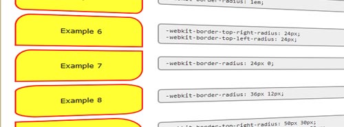
One of the most keenly-anticipated CSS3 properties is border-radius. Web designers will no longer have to resort to complex table structures using custom-made corner graphics or including arcane JavaScript files in order to produce designs with rounded corners.
While Internet Explorer doesn’t support many (or any) advanced CSS properties, you can get started using Firefox and any of the ‘Mozilla’ family of browsers. Apple’s WebKit web browser engine also supports rounded corners making them available in the Safari and Chrome web browsers, the iPhone and other devices running WebKit.
Simple and Nice Blockquote Styling
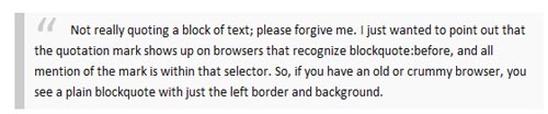
blockquote {
background:#f9f9f9;
border-left:10px solid #ccc;
margin:1.5em 10px;
padding:.5em 10px;
quotes:"201C""201D""2018""2019";
}
blockquote:before {
color:#ccc;
content:open-quote;
font-size:4em;
line-height:.1em;
margin-right:.25em;
vertical-align:-.4em;
}
blockquote p {
display:inline;
}
:-moz-placeholder
:-moz-placeholder matches form elements displaying placeholder text. This allows web developers and theme designers to customize the appearance of placeholder text, which is a light grey color by default. This may not work well if you’ve changed the background color of your form fields to be a similar color, for example, so you can use this pseudo-class to change the placeholder text color.
<!doctype html>
<html>
<head>
  <title>Placeholder demo</title>
  <style type="text/css">
    input:-moz-placeholder {
      color: green;
    }
  </style>
</head>
<body>
  <input id="test" placeholder="Placeholder text!">
</body>
</html>
Sticky Footer
I’ve shown you one way of making the footer stay sticky, now here’s another one:
* { margin:0; padding:0; }
html, body, #wrap { height: 100%; }
body > #wrap {height: auto; min-height: 100%;}
#main { padding-bottom: 150px; }  /* must be same height as the footer */
#footer {
        position: relative;
        margin-top: -150px; /* negative value of footer height */
        height: 150px;
        clear:both;}
/* CLEAR FIX*/
.clearfix:after {content: ".";
        display: block;
        height: 0;
        clear: both;
        visibility: hidden;}
.clearfix {display: inline-block;}
/* Hides from IE-mac */
* html .clearfix { height: 1%;}
.clearfix {display: block;}
/* End hide from IE-mac */
<div id="wrap">
        <div id="main">
        </div>
</div>
<div id="footer">
</div>
21 Awesome @font-face Embeddable Typefaces
While @font-face may not work in all browsers, I think it’s still one of the best solution available today. Of course not all type foundries will let us embed their fonts on our webpages. There are solutions like Typekit which look very promising but today we’ll simply go over the @font-face CSS property and check out some typefaces you can use with @font-face
Before you can start using those typefaces on your site you need to declare the font file(s) in your CSS file along with the font-weight and font-style if available. Like this:
@font-face {
font-family: GraublauWeb;
src: url("path-to-the-font-file/GraublauWeb.otf") format("opentype");
}
@font-face {
font-family: GraublauWeb;
font-weight: bold;
src: url("path-to-the-font-file/GraublauWebBold.otf") format("opentype");
}
Then you can call the font via the font-familly property. Don’t forget to put some other (web-safe) fonts there as a fallback option. Like this:
h1 {
font-family: GraublauWeb, Helvetica, Verdana, Sans-Serif;
}
Typefaces you can use with @font-face: Graublau Sans Web, Fertigo Pro Regular , Tallys, Diavlo, Fontin, Fontin Sans, M+ Outline Fonts, Pykes Peak Zero, Vollkorn, Delicious, Junction, Days, Sniglet, Chunk, Blackout, Gentium, Anivers, CA BND Bold WEB, Axel, Kaffeesatz, Tagesschrift.
(source and more info)
Text Rotation with CSS
Thankfully, many of the popular browsers of today support the ability to rotate HTML elements. Even better? We can make it work in Internet Explorer (back to version 5.5 even). How you might ask? Okay, let’s look at the HTML.
<div>
  <span>31</span>
  <span>July</span>
  <span>2009</span>
</div>
For Webkit and Firefox (as of 3.5), you can take advantage of the proposed transform property to handle the rotation. Each browser requires its property prefix for now.
-webkit-transform: rotate(-90deg);
-moz-transform: rotate(-90deg);
In order to perform a transformation, the element has to be set to display:block. In this case, just add the declaration to the span that you want to rotate.
When it comes to effects in Internet Explorer, there is a surprising amount of power (and untapped at that, I’d say) in using filters. Although misleading, there is a filter called BasicImage that offers up the ability to rotate any element that has layout.
filter: progid:DXImageTransform.Microsoft.BasicImage(rotation=3);
Background transparency
Being able to set the transparency of the background without affecting the transparency of the foreground (the text) is quite handy. That’s why there’s rgba() in CSS (red, green, blue, alpha). IE is not yet supporting it, but we can use the gradient filter which does support transparency. In this case we don’t need the actual gradient so we set start and end color to the same thing. Also the background: transparent is needed for the whole thing to work in IE:
.rgba {
  background-color: transparent;
  background-color: rgba(200,200,200,0.8);
  filter:progid:DXImageTransform.Microsoft.gradient(startColorstr=#99dddddd,endColorstr=#99dddddd);
  -ms-filter: "progid:DXImageTransform.Microsoft.gradient(startColorstr=#99dddddd,endColorstr=#99dddddd)";
}
Centering a DIV of Unknown Width
You can easily center a DIV by using margin:auto; property when you have mentioned its width in your CSS. But in case you wanted to center a DIV with unknown width, here is the code to do so :
.content {
	margin: 0 auto 8px;
	display: table;
	}
.content div {
	display: table-cell;
	}
<!--[if IE]>
.content {
	display: block;
	text-align: center;
	}
.content div {
	display: inline;
	zoom: 1;
}
<![endif]-->
Styling Links by File Type
You can easily style specific URLs by using icons. This works only with CSS3 compatible browsers and degrades nicely with non-compatible browsers. Make sure to change the icon image paths.
/* external links */
a[href^="http://"]
{
padding-right: 13px;
background: url(external.gif) no-repeat center right;
}
/* emails */
a[href^="mailto:"]
{
padding-right: 20px;
background: url(email.png) no-repeat center right;
}
/* pdfs */
a[href$=".pdf"]
{
padding-right: 18px;
background: url(acrobat.png) no-repeat center right;
}
Fix IE6/7 double margin/padding bug
This problem appears when a left/right floated elements has a margin/padding value defined. To fix that just target these browsers as you earlier learned in this article and add “display: inline” declaration.
ul li
{
  float: right;
  margin-right: 10px;
  *display: inline; /*Target IE7 and bellow*/
  _display: inline; /*Target IE6 and bellow*/
}
/* This example fixes the double right margin bug */
Change text selection style
::selection
{
color: white;
background-color: red;
}
::-moz-selection  /* Firefox needs an extra attention for this */
{
color: white;
background-color: red;
}
Drop cap
Drop cap is not an option only for books and newspapers, you can now use it in web designs also and it’s pretty easy to implement.
p:first-letter{
	    display:block;
	    margin:5px 0 0 5px;
	    float:left;
	    color:#FF3366;
	    font-size:60px;
	    font-family:Georgia;
	}
Style links depending on file format
Wanna learn UX. Start with this one. This css code snippet adds icons next to specific links so that the user knows where the link will take him to.
/* external links */
	a[href^="http://"]{
	    padding-right: 20px;
	    background: url(external.gif) no-repeat center right;
	}
	/* emails */
	a[href^="mailto:"]{
	    padding-right: 20px;
	    background: url(email.png) no-repeat center right;
	}
	/* pdfs */
	a[href$=".pdf"]{
	    padding-right: 20px;
	    background: url(pdf.png) no-repeat center right;